Categories
Uncategorized

White Noise on Paper: All Rise for “The Trial of Colonel Sweeto and Other Stories” by Nicholas Gurewitch

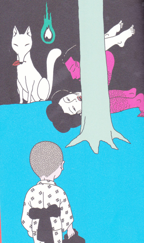
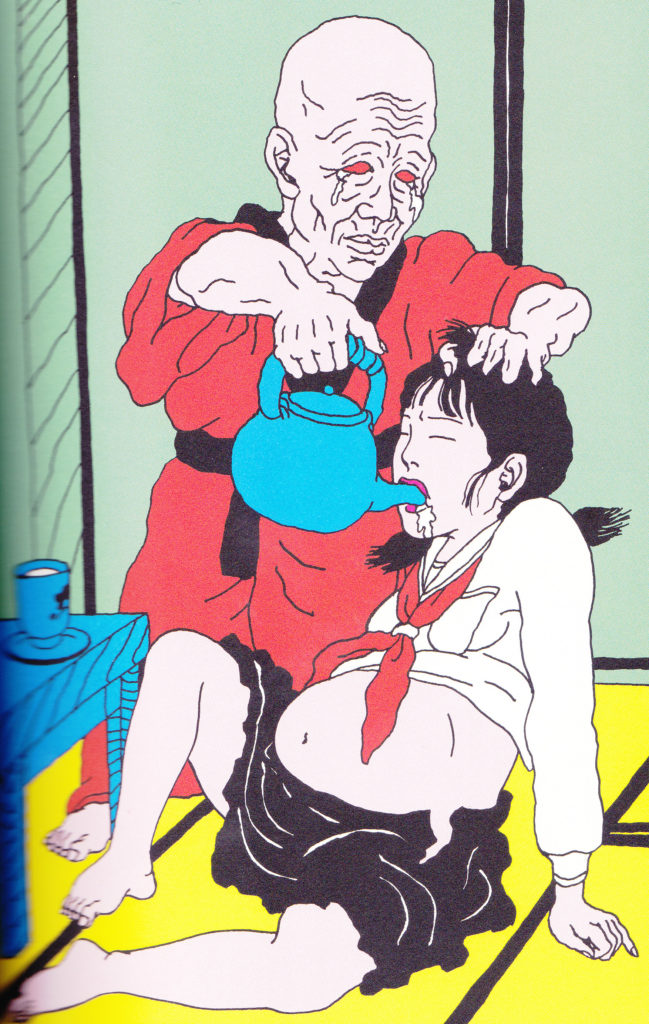
Don’t let the bright candy colors of the cover fool you, this is no ordinary “children’s book”, in fact, its not a children’s book at all. Bored and browsing through a mainstream book store where my then girlfriend was looking in the boring Harlequin Romance novel section, my eyes fell on this. At first I thought it was a kid’s book until I opened it, my boredom melted away like Rainbow Sherbet in a hot summer sun. I was laughing so hard I was annoying other customers. I promptly went and bought it. My then girlfriend thought it was disgusting and that is why she is now my ex.

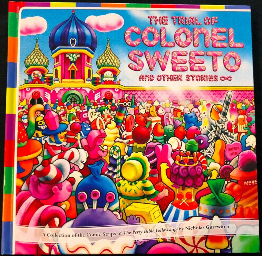
Its as if some maniac played too much “Candy Land”, read too much Frank Baum books, and watched too many episodes of South Park and then decided to make a comic strip. I love this book, it was unique in that it was almost presented as a children’s comic collection but the humor was messed up, and stomach churning in some cases.

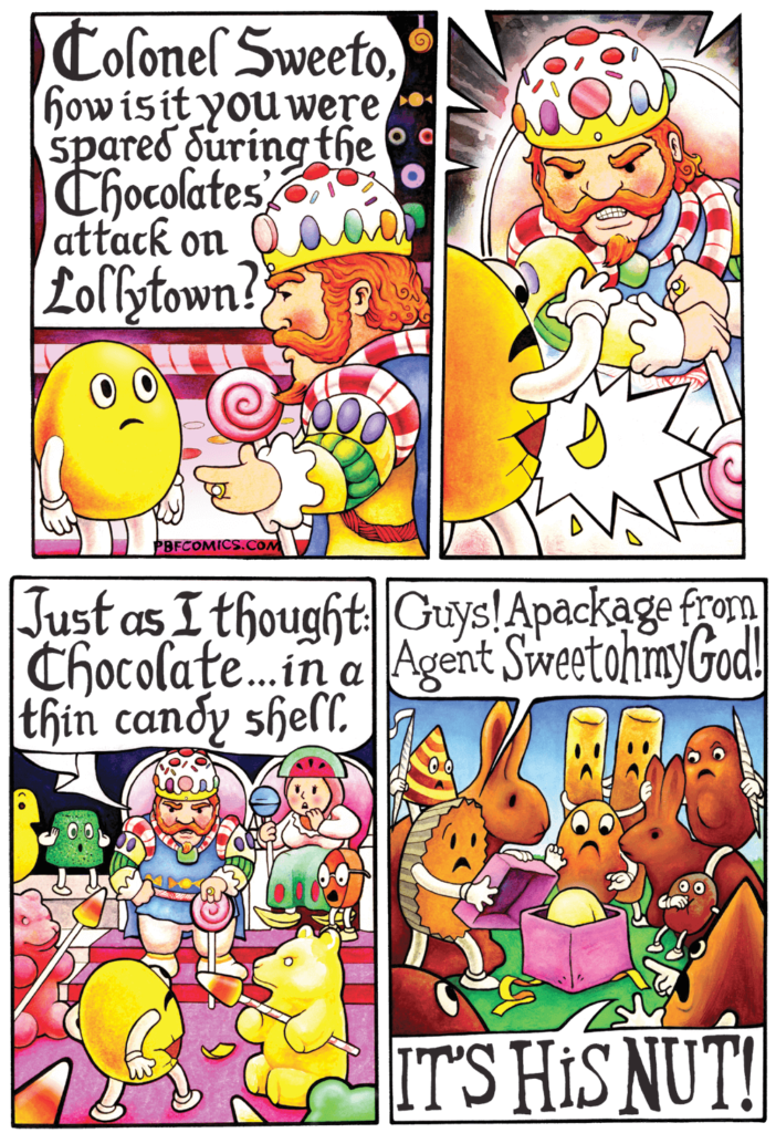
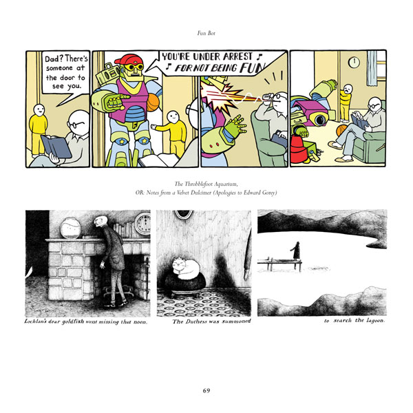
The creator, Nicholas Gurewitch, was art director of the Syracuse student paper “The Daily Orange” and first published the strip, “Perry Bible Fellowship” there in 2001. Since then different publications have picked the strip up. The art work can vary from strip to strip which makes the whole thing interesting. The whole book is full of snickers and/or outright belly laughs. Most of the strips in “The Trial of Colonel Sweeto and other Stories” are taken from previously published work. Man oh man where does Nick come up with this stuff?

According to Nick, “Perry Bible Fellowship” is actually named after a real church in Perry, Maine. A lot of the humor is abstract and non sequitur if this annoys you then you might want to avoid this book. Scratch that, if that annoys you why are you reading my blog? Fuck right off. HA! HA! This is something that puts a smile on my face if I am in a bad mood. I am so glad something like this exists, if it didn’t I hope me or somebody else would’ve done it as good as Nick does it.

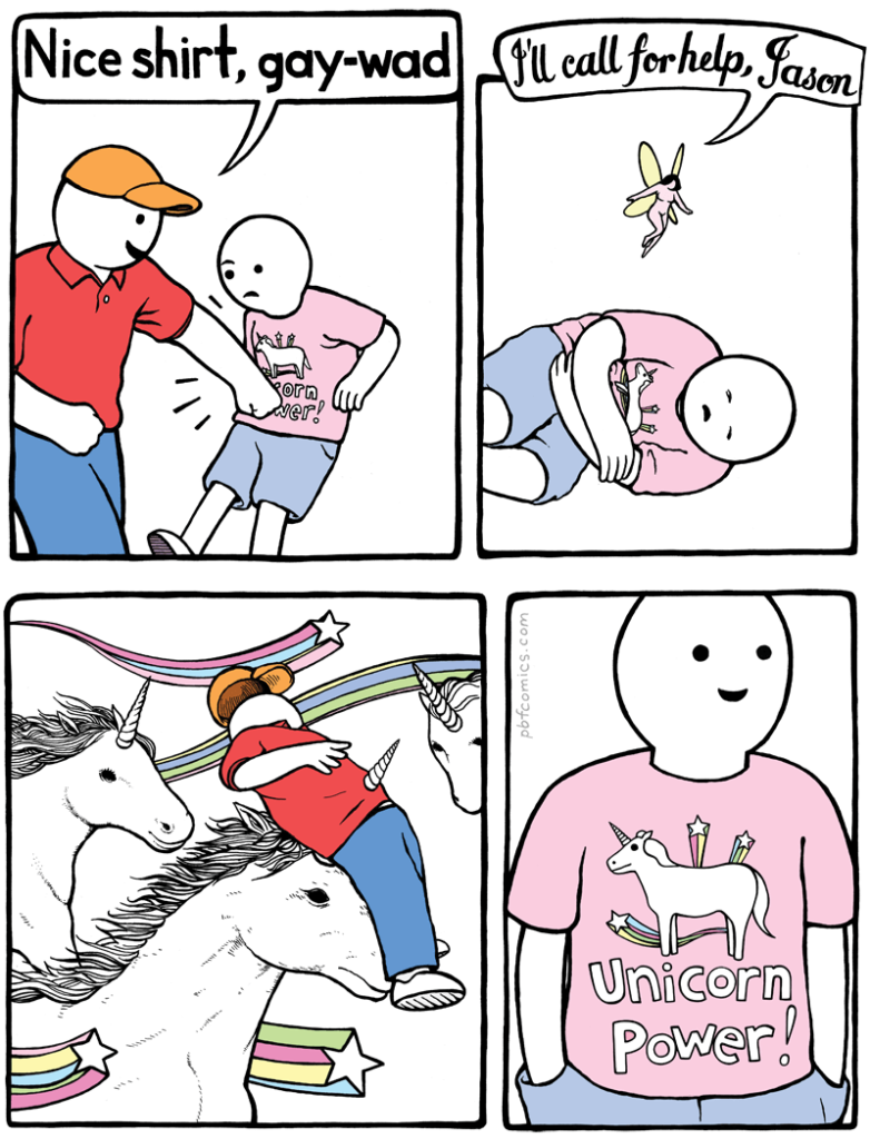
Nick still till this day updates “The Perry Bible Fellowship” web site, less frequent than he used to do. I am glad he is keeping this going and hasn’t given up on it, the world needs this now more than ever. There is a lot of humorless twats walking around today, maybe they need a unicorn horn thrust through their chests…A unicorn horn of HUMOR.

This insane candy colored, ridiculous, off the wall world needs to be explored more. There is another book out there “The Perry Bible Fellowship Almanack” with more comics, probably out of print and a lot of money. I am glad I bought this when it came out, a lot of the books I like become worth big bucks. I hate when I miss out on something cool the first time around, the price gets insanely jacked up.

So where does one go to have Perry Bible Fellowship study? First you can go to Nick’s site which he still updates infrequently, https://pbfcomics.com/

Cheap copies can still be found used on amazon, get them while you still can: https://www.amazon.com/Colonel-Fellowship-Nicholas-Gurewitch-2007-09-03/dp/B01F81KGT0

And AMEN!!!!

Categories
Uncategorized

White Noise on Papers: “Object Compendium” of your affection.

The hey days of the comic magazine for adults, “Heavy Metal” art wise, were the 1970’s and 1980’s. You opened the then current issue of “Heavy Metal”, skipped the pretentious, wanna be “Rolling Stone” type column and reviews that were written by the then snobby up his own ass hipster editor Lou Stathis,  to artwork that would explode out of the page and hit you full in the face. That art had power and one of these days I will do a post on “Heavy Metal” I have all the issues from the first one, to the most recent one. While its still good, it doesn’t reach the heights of the days of Moebius, Suydam, Corben, Druillet etc. so what does this have to do with the book “Object Compendium” by Kilian Eng? I’d say that Kilian is the heir apparent of Moebius and those old masters of abstract, dark fantasy. This book is like opening an old issue of “Heavy Metal” I want more.

The book was put out by “Floating World Comics” based out of Portland, OR. They publish underground art and comics, I highly recommend looking at what they have if your into the weird and different spectrum of art. And thank God they decided to compile Eng’s art work into books and finally all those books into one big book. The books that are compiled into this one are “Objects 5, 10 and 15” all of which ran out really fast and you can see why. Eng’s artwork is a rocket ship taking you into different, strange, dark and beautiful worlds. This actually includes work not featured in the books collected. Its nice and large, hard bound, it can also be put to practical uses like smashing spiders and throwing it at your annoying neighbor’s head when he plays Jimmy Buffet’s “Cheeseburger in Paradise” for the hundredth time on his shitty stereo (not speaking from experience *wink* *wink*)

I spent at least an hour perusing this book trying to drink in every strange detail. His art is cryptic, one can spend a long time looking into each picture trying to solve a puzzle. The forward, written by Chris Jalufka, says Eng really has no social media presence, good for him, if he can pull off promotion without pandering to every Tom, Dick, Harry and Sally more power to him. He is Swedish and a graduate of Stockholm’s Arts and Crafts university, Konstack. He designs and does art for commissions, video games etc. Originally he wanted the “Object” books to have cryptic pictures of a fictional crime scene in a different world. He gives no narrative structure for his art he wants you to come up with your own ideas and conception of what his art is representing.

When I found out Eng’s favored choice of medium is “Digital” I was surprised. Most digital art I have encountered is flat, soul less and too clean. Eng’s isn’t. His artwork carries on the burden of Moebius and Druillet, strange, dark, puzzle worlds to get lost in. Opening this book was like when I first opened an issue of “Heavy Metal”, buxom women, explosions, violent color and weird aliens, I’d never seen anything like that in a “comic book” up until that point when I was a youngin’ which was a long time ago, get the hell off my lawn dammit! In fact, Eng has done work for the current issues of “Heavy Metal”.

I love when there is no explanation for a piece of art or a comic, you come up with a reason why something is happening in the piece in your own mind. People are going come up with tons of different interpretations: “Its symbolic”, “Its psychological”, “Its nonsensical”,  “Its beautiful”, “Its stupid”, “Its ugly” etc. Eng forces you to do that with his pieces.

This visual white noise is worth de scrambling. And if your a fan of the old “Heavy Metal” Moebius you should most definitely pick this up. Eng gives me hope for the future of art, a lot of young artists who are coming up are combining the old with the new. I discovered this artist combing “Floating Comics” web page looking for stuff to burn all the money in my bank account. All the “Object” books were out of print at the time and I went on ebay and got “Object 10” to find out that all the books were gonna be released in “Object Compendium”. One of these days I will put “10” up on ebay for collectors. Anyways to find out more about Eng’s work go to his instagram page: https://www.instagram.com/kilianeng/?hl=en

Here is where to buy it: https://floatingworldcomics.com/shop/art-books/object-compendium-works-by-kilian-eng-preorder


Categories
Uncategorized

White Noise on Paper: What a bunch of “Garbage Pail Kids”.

As a little kid I had to hide these stickers from my parents, hell, I wasn’t the only kid. Me and my friends in elementary school had to trade these to each other in secret, that is until a teacher’s aid snuck up on us while I traded a “Glooey Gabe” for a “Micheal Mutant”. We were sent to the principal’s office, the principal was disgusted and our parents were called in. “Garbage Pail Kids” we’re beyond the pale (sorry couldn’t help my corny self). My parents weren’t too happy I was spending my allowance on these things, they were promptly thrown away which made me want to get them even more. Through the years I’d stumble on them, yeah they were juvenile, yeah they were disgusting and yeah this blog wouldn’t exist without the “Garbage Pail Kids”. My parents were right, they did corrupt me and I am happy about it. I was even more happy when “Abrams Comic Art” publishing decided to put out a book compiling all the art from the stickers, I was like a little kid again. A few Christmases ago my mom sent me a small wrapped gift, I opened it and it was a stack of vintage “Garbage Pail Kids” stickers she had found on one of her thrift store hunts, in the note she put “Now your old enough to have these.” HA! HA!

The forward written by the creator and main art director, Art Spiegelman, future creator of the underground comic “Maus” and the underground comic magazine “Raw” was art directing “Whacky Pack Stickers” at Topps cards at the time. Topps couldn’t secure the rights to “Cabbage Patch Kids” stickers so they made parodies, “Garbage Pail Kids”. Spiegelman had got the idea for them from older and disgusting precursors like “Slob Stickers” and “Ugly Stickers”. Needless to say they took off.

James Warhola, Andy Warhol’s nephew, worked on the art as well as various underground cartoonists who went on to do more work. To see more of the artwork I had to go over to my cousin’s house whose mom, my aunt, was an ex hippie and a little more loose with the rules in her house. That is how I was able to view movies I otherwise couldn’t see in my religious household, my cousin, who was my same age and my older cousin, his brother, collected them, they had them in a hard back spindle binder behind plastic holders. Cards with names like “Hairy Gary”, “Joe Blow” and “Disgusting Justin”.

Of course this made us make up our own names for cards and we ended up drawing (poorly I might add) our own characters. Our dirty minds came up with “Hormone Harry” which was a drawing of a “Garbage Pail Kid” with his eyes bulging looking at a Playboy, his tongue lolling out and something else south of the belt buckle bulging. As the years went on my mind got confused and I literally thought this was a sticker, in fact when I bought this book I thought that they were missing some. It isn’t missing any stickers, these were ones me and my cousins made up, my cousin had to remind me of this. Boy am I getting old.

Lets not forget the art on the back of the cards which was done by German underground cartoonist, Tomas Bunk. Who would’ve thought these little disgusting stickers, hated by parents would become fine “art”. The people who say their “fine” art need to drink Drano, their not “fine”, their low brow, mean, nasty and not politically correct, which means they are the right kind of art. My art. Art that doesn’t give a fuck, that is the way art should be. Apparently the original art goes for mega bucks on ebay. 

The afterword is done by one of the artists who worked on the cards, John Pound. He mentions how in the early 2000’s Topps put out a new series of “Garbage Pail Kids” stickers, haven’t come across or seen any of them. Wonder if they hold water to the originals. People also tend to forget the “Garbage Pail Kids” (1987) movie which I will review in the future, I didn’t see that until like four years ago. Yeah its shit, but I am watching it again, its mindbogglingly disgusting and bad, with crass humor and adult sexuality, it has a PG rating, that is the 80’s for you. So in closing this bit of visual white noise is a must for anybody, visceral and good to have around to piss off your more offended friends or enemies. The Pail Kids don’t give two fucks, get this static in your life, the book’s cover is made of the same paper you used to unwrap your cards and stickers from. To get it go to: https://www.amazon.com/Garbage-Pail-Kids-Topps-Company/dp/141970270X/ref=sr_1_2?dchild=1&keywords=Garbage+Pail+Kids&qid=1609445296&s=books&sr=1-2

So enjoy your garbage, noise freaks.

Categories
Uncategorized

White Noise on Paper: Plunge spheres deep into “Sin-A-Rama”.

In a used book store you walk by titles like “Watership Down”, “The Hobbit”, “Fried Green Tomatoes”, “Satan was a Lesbian”, “Martian Chron…wait what? You go back, pull “Satan was a Lesbian” off the shelf in it’s plastic wrapper, the lurid cover is a illustration of an leather momma beating the hell out of a coat and tie little wimp with a whip. Whats the price…what? Thirty fucking dollars for a book from 1966? Heart in your throat its either you eat and drive home on a full tank of gas, or you buy this book, drive home hungry and almost hit the empty on the fuel gauge. Whelp, hungry and empty  fuel tank it is. “Sin Rama” is the book that gives the history of those weird, creepy, perverted, unsettling and hilarious soft porn books of the 1960’s and their lurid covers. Put out by the king of weird publishing, “Feral House”.
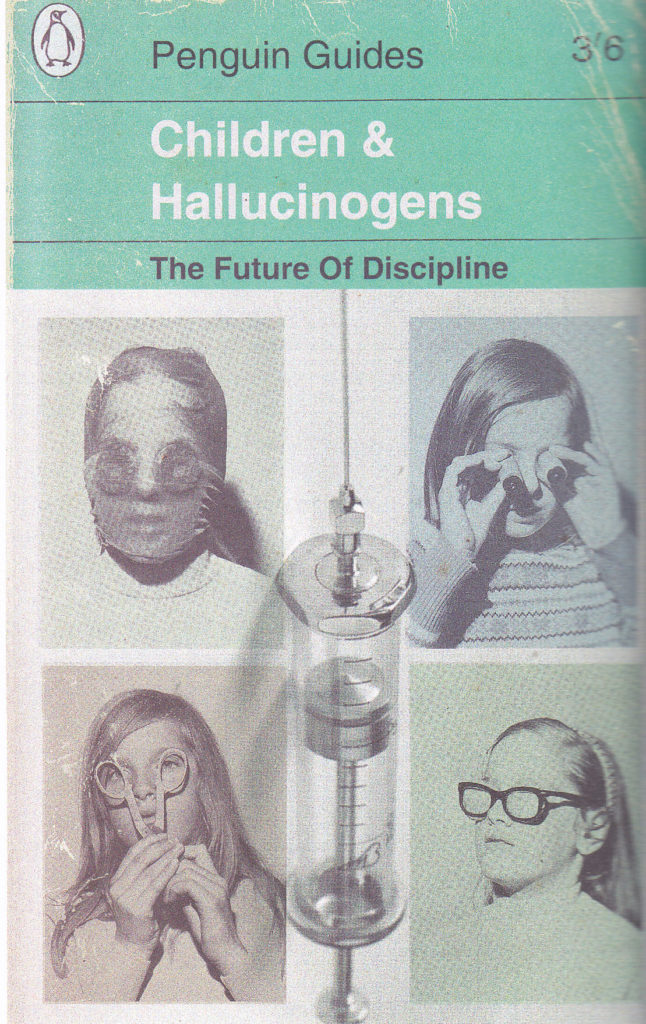
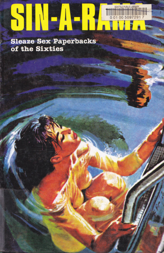
The first part is dedicated to the history of the soft core paperbacks of the 1960’s: the fly by night publishers, the authors who wrote under 100’s of pseudonyms and the artists of the lurid, goof ball covers. In fact it was the covers that normally sold the books, normally the stuff in between the covers was amateurish, stupid and ridiculous. The laws were still strict against pornography so they really had to tiptoe around a lot of talk about genitals and sexual intercourse.

A good amount of the authors went on to write under their real names and became successful, Robert Silverberg and Maron Zimmer Bradley are some names that might sound familiar who started out writing these things. The soft core adult paperback industry gave authors just starting out a chance to make some money and most of them wrote these things on typewriters. Some of the fly by night publishers who put these books out were run by mafia types which isn’t a surprise. Artists like Gene Bilbrew and Eric Stanton did the covers, got paid very little and went under assumed names. Gene Bilbrew was black and a rarity among cover artists, his covers in particular really jump out. Eric Stanton is known as a fetish, leather artist.

Books like these kind of piss me off, not because their boring but because they make me look for the titles in the book, I call books like these “Wallet Emptiers”. Again, another obsession I can’t afford, I have a few soft core 1960’s titles which I found on Abe’s Books, other used book web sites and used book stores, they aren’t cheap either. “Sin A Rama” collects these covers and interviews the authors still alive who put out these pulp novels.

Reading these is the equivalent of watching low budget, sleazy, softcore 1960’s B movies, movies put out by the likes of Doris Wishman and Russ Meyer. Their a hoot, and a laugh and they aren’t 500 pages long or in movie length speak, two and half hours long. Its fast food reading, not healthy but boy is it good going down. Sometimes I’ll pick up one of these books and read a random passage. I always get a chuckle.

This is a beautiful book it has slick pages and its in full color, the interviews  are really interesting and it gives a breakdown of what the industry had to deal with: pissed off judges, puritan cops and hypocritical moral guardians going after books that are child’s play compared to what is in a young adult novel these days. The authors had to be more creative when talking about sex, which makes the dialogue and some passages hilarious.
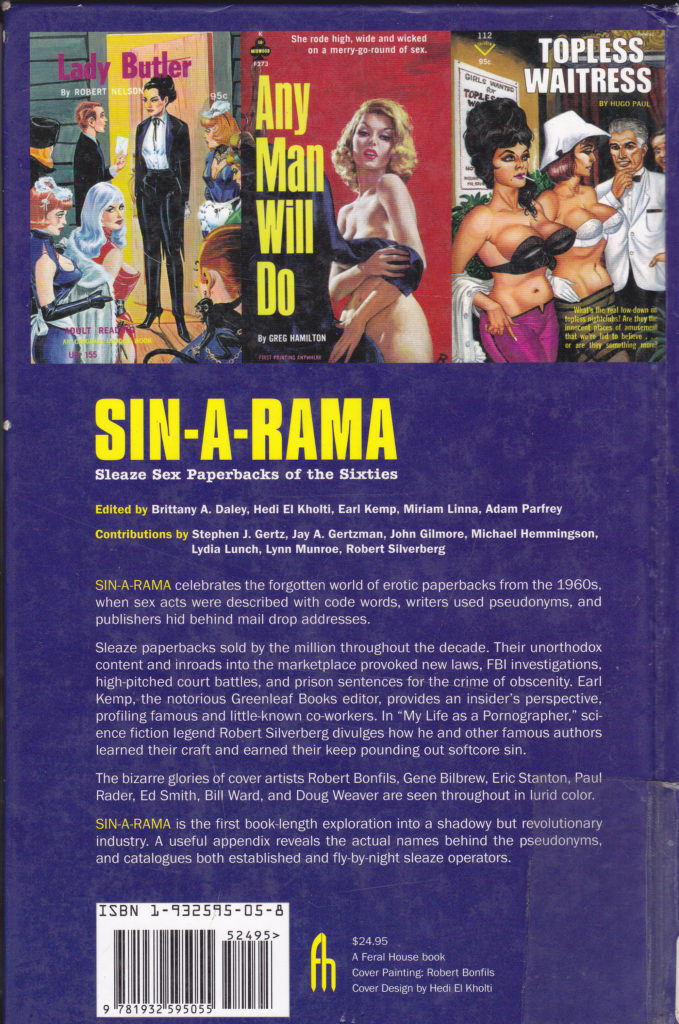
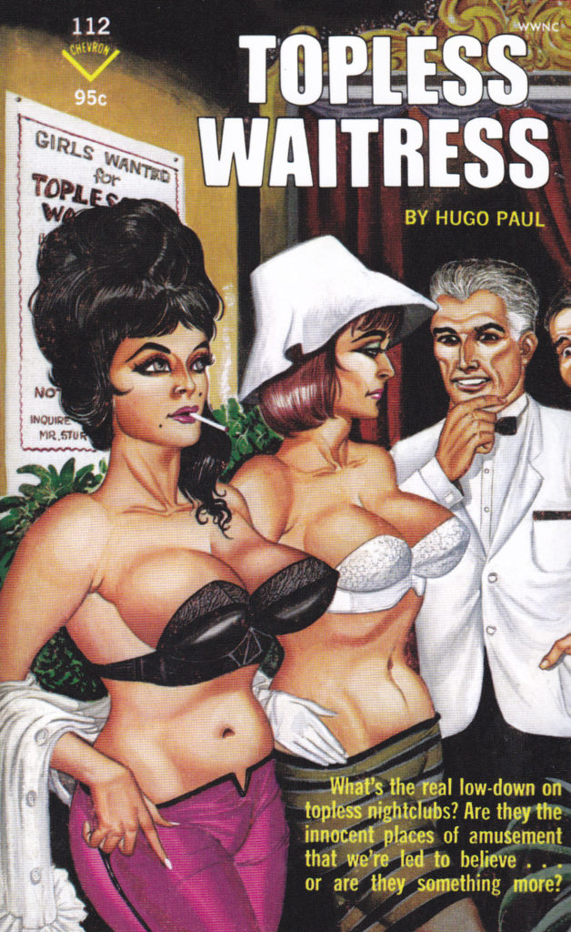
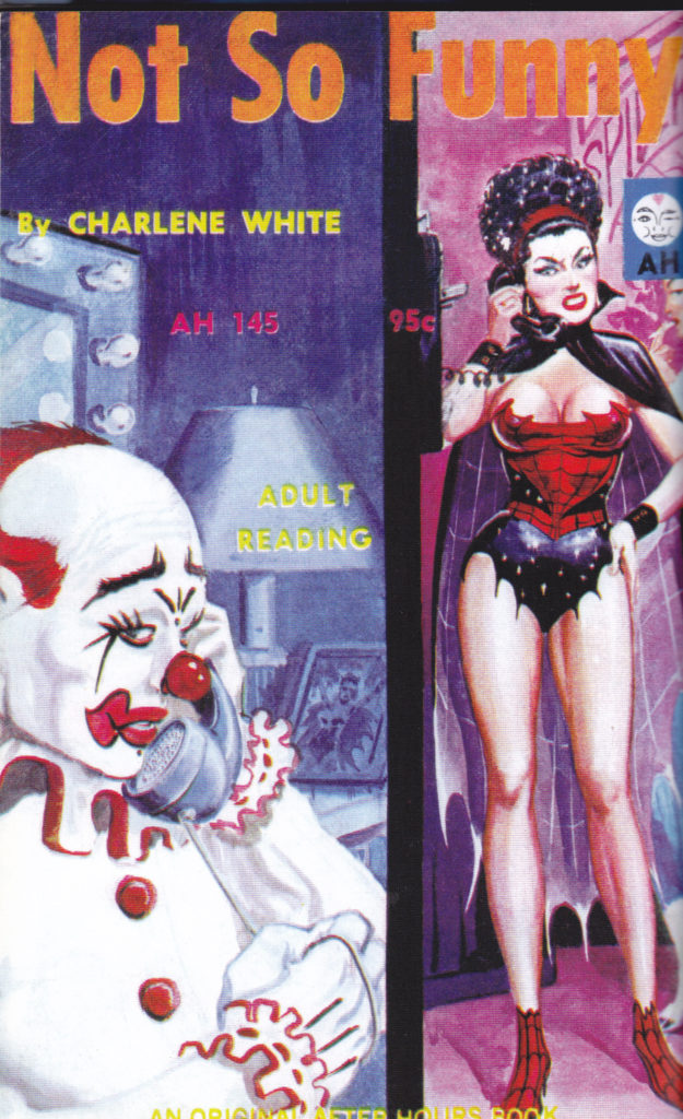
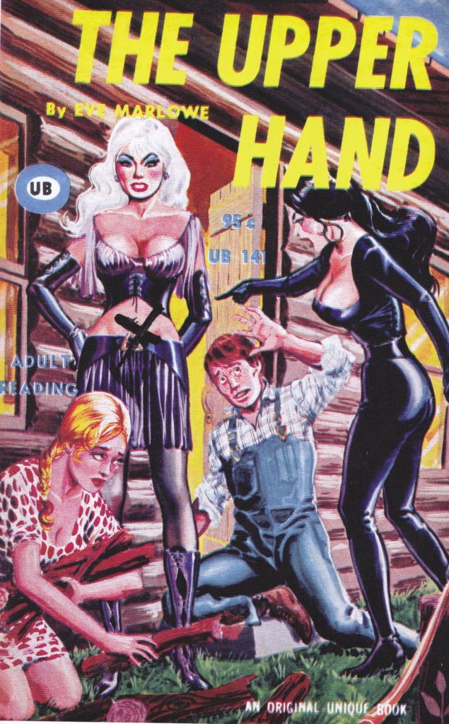
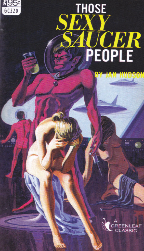
The visuals were the main selling point and the goofy titles. “Sin A Rama” is a must have for visual white noise fanatics. Get your paws on this thing, I was glad to have found it in a used book store. Feral House always does a good job on their books “Adam Parfrey, RIP”. This thing is good to have lying around when you have visitors, it causes laughs, scoffs and conversation. This is something that will brighten your life and that is always good.

To get a copy the best place would be amazon, and Feral House released a expanded edition which I will need to get and it can be found here: https://www.amazon.com/Sin-Rama-Expanded-Paperbacks-Sixties/dp/1627310282/ref=sr_1_1?dchild=1&keywords=Sin+A+Rama&qid=1608751353&s=books&sr=1-1

So plunge spheres deep into “Sin A Rama”.

Categories
Uncategorized

White Noise on Paper: Enjoy the scenery on “Crystal Bone Drive”.

Want to trade your heart with tentacles for money? Then come on down to the Crystal Bone exchange, just make sure you don’t  cough out your lungs, artificial or organic, in the poisoned atmosphere getting over here. That is “Crystal Bone Drive” in a nutshell. 
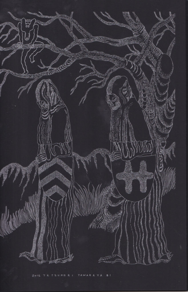
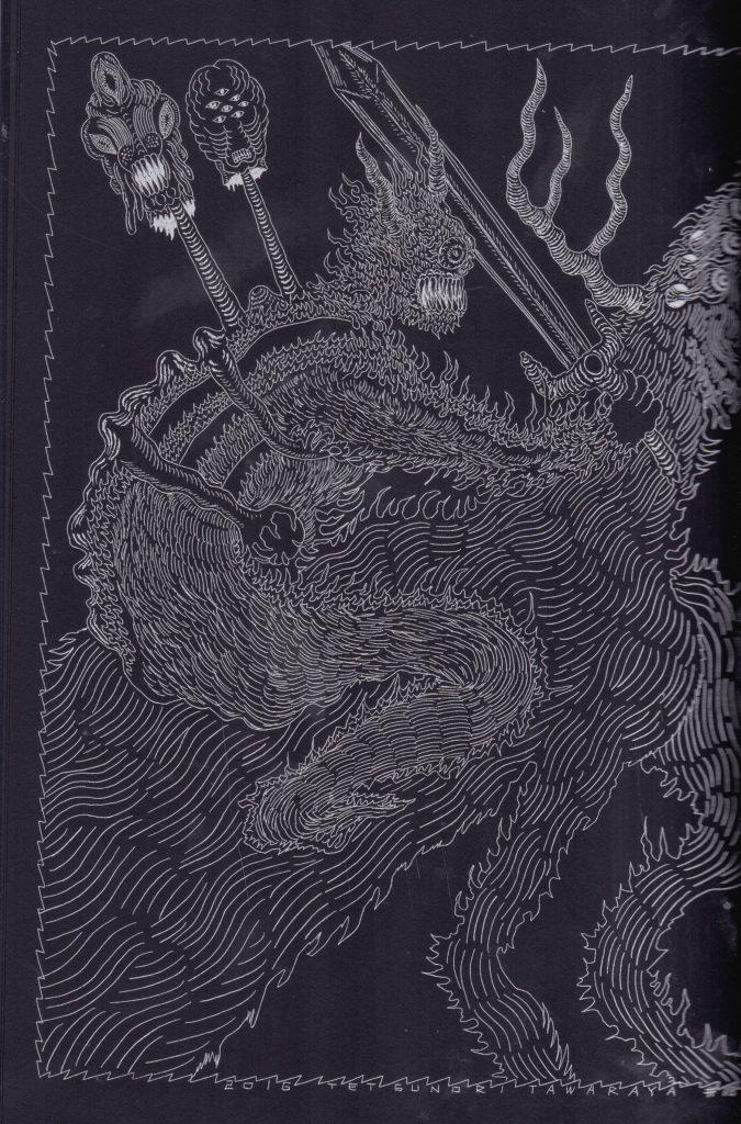
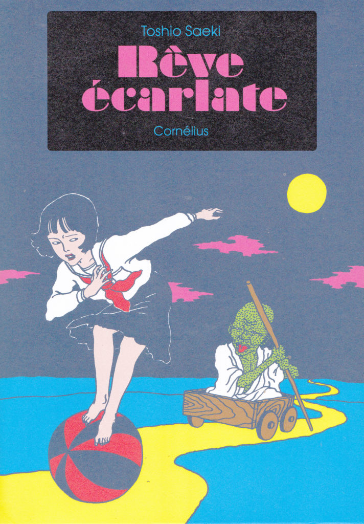
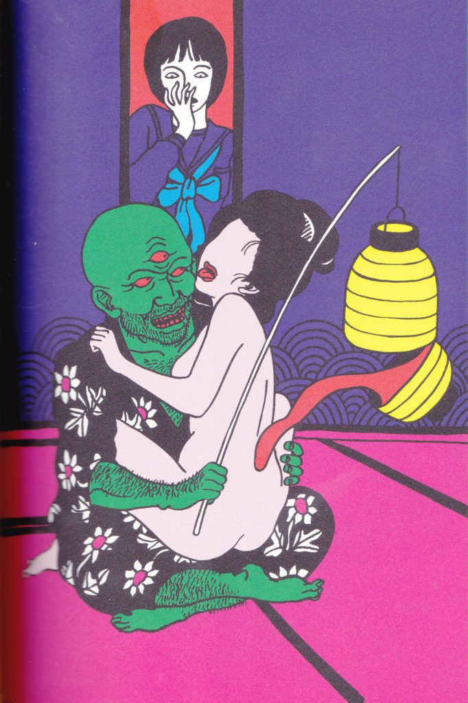
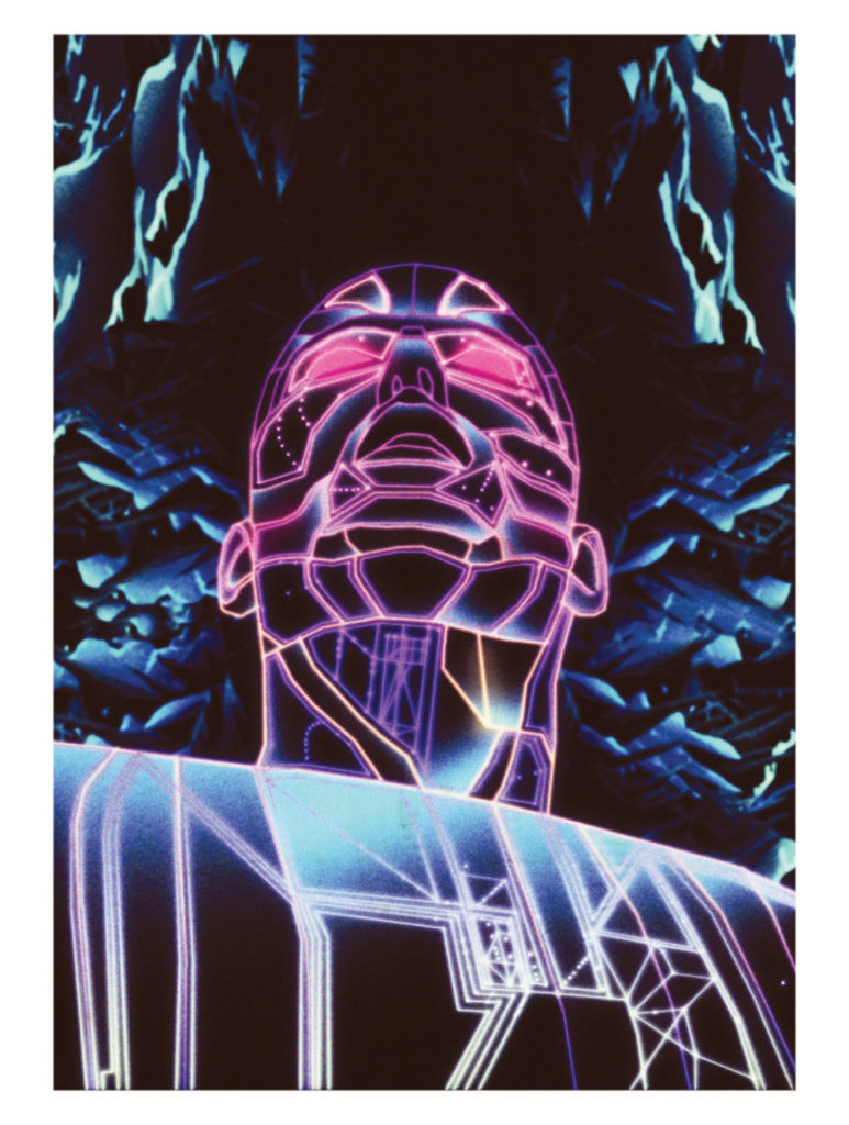
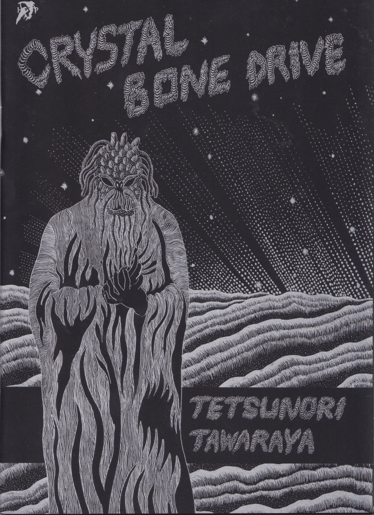
Drawn by Japanese artist Tetsunori Tawaraya with silver ink on Plike black paper this 7″x9″, 32 pages of visual white noise pummels your eyes until you can’t take it no more. Published by Hollow Press in limited quantities, this biomechanical nightmare will draw you into its silver dark world. Flesh morphs into motorcycles, giant slugs with razor sharp teeth attack, metal and flesh combine in a grotesque beauty.

Tetsu is also lead singer and vocalist for noise band 2up, he has been active drawing since the late 1990’s, mainly messed up sci fi comics. His art is in a lot of publications and his drawing style is really distinct, flowing, fine lines twisted into various shapes, all of his worlds seem populated by mutants, most hybrids of machinery and flesh.

Its refreshing to see a Japanese artist not rehash traditional Manga art all the time, don’t get me wrong that has its proper artistic place but sometimes it becomes redundant. I love artists both audio and visual that craft noise that takes me to another world, this comic does this. I thumb through it occasionally marveling at its grotesque beauty, I have two other works by Testu which I will review in the future. If you can get a hold of his stuff, do it, the problem is that a lot of his stuff is printed in limited quantities. It kind of pisses me off when publishers do this, it seems like a “hipster-up-its-ass” move that lots of people can’t enjoy that world but it is what it is and a lot of these small publishers don’t have a lot of money to burn they can’t all print 10,000 copies of something all the time.

To find “Crystal Bone Drive” your gonna have to hit up ebay. However here is Tetsu’s site he has some stuff for sale up there: https://tetsunoritawaraya.com/


Categories
Uncategorized

White Noise on Paper: Going to “Scarfolk”, gonna disappear…

Imagine your in England. Imagine your driving through the beautiful country side and you come upon a strange town. Imagine that this strange town has people, places, signs and things stuck in the 1970’s. Imagine you ask directions to a restaurant and the guy who points the way is missing a hand and leg. Imagine you walk into this restaurant where the cashier behind the counter has clown make up. Imagine that you order a soda, you drink the whole thing and feel funny. Imagine you end up ground up in between two buns and then you’ll know what it is like to peruse “Discovering Scarfolk, For Tourists and Other Trespassers” by Richard Littler.

Richard Littler is a graphic designer and started making joke cards for family friends parodying those old Penguin book covers, he posted them on his blog and got a huge response. I first stumbled on his work on tumblr and the art work looked so authentic I thought that they were actual book covers. When I went looking for the books themselves so I could add more to my weirdo book collection, “Scarfolk” came up and then I had a treasure trove of satirical book covers, ads and public service announcements to devour.

 The book is like one of those hardbound tourist guides, Littler’s artwork is throughout the book, what ties this book together is a father who goes looking for his twin sons when they go missing in Scarfolk. In Scarfolk everything is assbackwards, and time doesn’t pass there either, the whole town is stuck in the 1970’s. Littler also wrote scripts for movies, he merged his artwork with his story telling abilities to hilarious result.

Some of the humor will be lost on people who aren’t from Britain. There is a lot of cultural humor and the British Dry wit, but despite that the book had me in stitches. It is satire sharpened to very fine point, one can see his lampooning of the surveillance state and people too stuck in the past to move forward. At times it becomes nightmarish, the father in desperation not being able to get answers about his kid from people that seem bat shit crazy from the mayor (which is the author) on down to the local garbage collector, it becomes so surreal and dark you bust up laughing.

He is still producing stuff. He has a youtube channel with Scarfolk ads and music on it, he has a blog which I will link to, and he has another book “The Scarfolk Annual” which I have and will review sometime. Artists who create noise and harness it into a world of their own are my favorite people, they make life worth living. “Discovering Scarfolk” gets two severed thumbs up from me, old boy.

Richard isn’t the only artist to do this, there is a lot of artists that are lampooning retro book cover art but they aren’t as funny as Richard is. I love just picking up the book and randomly selecting a section, and it normally puts a smile on my face that something like this exists.

So do you wanna go to Scarfolk?! Do you really REALLY want to go? Do you want to be chased by stapler demons? Given a ticket for keeping your eyes open and wasting “electricity”? Do you wanna probably end up as some person’s plastic sheet covered furniture? Then the way to get there is here:

Richard Littler’s blog: https://scarfolk.blogspot.com/

Where to get the book: https://www.amazon.com/Discovering-Scarfolk-Richard-Littler/dp/0091958482

Hate fucking youtube but Richard’s videos are too good to pass up: https://www.youtube.com/channel/UC1t7KxXy44QC5qC1R0h53Mg

Now…disappear!!!

Categories
Uncategorized

White Noise on Paper: Reve Ecarlate by Toshio Saeki Is Gonna Gouge Your Eyes Out!!!

Want to have waking nightmares? Want something that will make you want to rub your eyes with Brillo pads after viewing it? Than look no further than:

Toshio Saeki, is one of those creepy “Ero Guro” Japanese artists that paints or draws people and things being raped, eviscerated, sucked, shelled etc. in vibrant colors. This book is an anthology of 20 years of work that was first published in SM Selecto Magazine.

It starts with art from 1970 and ends with 1972, Saeki uses vibrant colors and his artwork is nightmare like he uses a lot of Japanese culture and mythology in his art, strained through a bat shit crazy mind.

Jean-Louis Gauthey the guy who put this book together put it pretty good “Each and everyone is convinced to find something they already know: Hiroshige’s precise stroke, Sade’s perversity, themes dear to Ranpo and Herge’s clear trait.” And yes as you can see De Sade’s perversity is sprinkled liberally throughout.

I even have problems de scrambling this visual white noise. It is sick but it is unique, it makes it almost even more disturbing the neon and pastel colors he uses and simple line form of drawing. There is a disturbing beauty in this stuff I find intriguing.

This is a warning to you some of you, maybe some of you like me have built a tolerance for audio and visual drugs, this book might make you overdose, it will empty your wallet and it isn’t cheap but it is well worth it for anybody who needs visual white noise in their lives.

So if you want to get a hold of a copy of this book, I got to warn you they are in limited quantities but the folks at Aka Tako have copies left, Aka Tako has other Ero Guro artists in its stable that I’ll have to eventually check out!!! To get it: http://www.akatako.net/japanese-art/toshio-saeki-reve-ecarlate